AT309 Lab #7 Intro to Arc GIS Pro
- Leighton Moorlach

- Nov 5, 2021
- 8 min read
Updated: Mar 22, 2022
Background:
In Lecture were provided with a demo of ArcPro GIS software, and had the ability to look at some of its functionalities using UAS data as an example. Complete the questions in this lab and use those to help you craft a post where you relate what you did in this lab to UAS possibilities for analysis using geospatial software such as ArcPro.
Objectives:
1. Objective #1: Discover, identify, and the apply basic functionalities of ArcGIS Pro Software.
2. Objective #2: Recognize, relate, and compare the functionalities of multi-band UAS Imagery
3. Objective #3: Demonstrate proficiency and knowledge on how to effectively utilize spectral bands to given applications and identification of objects using imagery tools in ArcGIS Pro.
1. Data Copy/Preparation
a. Create a folder in the C:\temp folder and name it username_UASmapdata
b. Navigate to the AT309ClassData folder on the server (T:\AT309\AT309_Classdata) then copy and paste the DoakBurn folder into the folder you created in the C:\temp folder
2. We will start by reviewing the metadata. Within the DoakBurn folder, open the 091919_Bramor_Burn_flt2_METADATA.txt file.
a. Provide information for the following categories:
Vehicle: Bramor ppX
Sensor: Altum set to 1ms and 16Bit TIFF
Flight Number: 2
Takeoff Time: 12:18pm
Landing Time: 12:35pm
Altitude (m): 121
Sensor Angle: nadir
b. Why is such information so important to record in the field related to these data collection missions? That is, why is this information of use to the person analyzing and working with the data?
It is especially necessary to have the metadata when working in teams so anyone who may access the data will know the important details about the data and how it was collected.
3. After reviewing the metadata, open ArcPro, then open the DoakBurn ArcPro Project.
a. You should see a basemap with no UAS layers yet turned on. That is because we are going to review the data layers by referring to what bands each layer covers. Use the figure below to answer the peak reflectance for bands 1-5 on the Altum sensor.

Figure 1: Micasense RedEdge Peak Band Reflectance.
Blue: 55%
Green: 58%
Red: 56%
Red Edge: 56%
NIR: 55%
4. Now we are going to go through each of the layers and view them keeping in mind the peak reflectance values in Figure 1 above.
a. Turn on the Blue band. What features have the brightest reflection? What has the lowest? Do any particular features jump out?
The paths really popped out to me right away, also the plow lines in the bottom left hand portion of the field have a high reflection. The trees and a high portion of the field have a low reflection. No features are jumping out yet.
b. Turn off the Blue band, and turn on the Green band. What features have the brightest reflection? What has the lowest? Do any particular features jump out?
The entire field now has high reflection. The trees have more reflection but still less than the field. No features jump out.
c. Turn off the Green band, and turn on the Red Band. What features have the brightest reflection? What has the lowest? Do any particular features jump out?
Looks similar to the blue band except the paths jump out less but they have a higher reflection. The trees now have very little reflection.
d. Turn off the Red band, and turn on the Red-Edge band. What features have the brightest reflection? What has the lowest? Do any particular features jump out?
Almost everything has a high reflection. The shadows are the one area where there is low reflection. The outline of the field is jumping out.
i. Here also note the difference between red and red-edge. What is red-edge useful for?
Red and red-edge are almost opposite here. Red-edge is useful in monitoring plant and vegetation activity.
e. Turn off the Red-edge band, and turn on the NIR band. What features have the brightest reflection? What has the lowest? Do any particular features jump out?
The tree tops and some of the tall brush have the brightest reflection. The shadows have the lowest reflection. The area in the top left hand corner is jumping out.
f. Turn off the NIR band, and turn on the LWIR (long-wave infrared band) for Doaksburn_thermalprocess_lwir. What features have the brightest reflection? What has the lowest? Do any particular features jump out?
The paths by far reflect the most. The trees and everything else have the lowest reflection. The path jumps out.
i. What is this band sensing? How does this differ from the NIR?
Its detecting warmer areas on the map.
g. Turn off the LWIR band for Doaksburnthermalprocess_lwir, and turn on the LWIR (long-wave infrared band) for Doakspostburn_band6_mosaic_lwir. (This is the thermal image from immediately after the burn) What features have the brightest reflection? What has the lowest? Do any particular features jump out?
Four plots of the field now have the highest reflection. Everything else surrounding the plots is dark with very low reflection. The plots of the field definitely jump out.
i. Now what features show up as the brightest?
The 4-5 small sections of the field are the brightest.
5. Now that you’ve viewed some data layers, lets explore the data layer properties a bit. As a rule of thumb, you always should know what you are working with.
a. Let’s start simple with pixel reflectance values. In the contents area, each of the data layers has a color ramp related to their pixel reflectance. In the space below, create a table and list out the reflectance value range for each of the 6 data layers you looked at in question 5.
Blue band:
0-65504
Green band:
0-65504
Red band:
0-65504
Red-edge band:
0-65454
Near infrared band:
0-65377
Long-wave infrared band:
0-31602
b. Now lets explore Layer Properties a bit more. (metadata and coordinate systems). Right click on the blue band and select properties.
i. Click on Source, then expand Raster Information.
ii. What is the X and Y cell size? (units are in Meters)
X: 0.0562600000000018
Y: 0.0562600000000325
iii. What is the radiometric resolution?
16 Bit
iv. Scroll down and expand Spatial Reference.
v. What is the Projected Coordinate System? (We will learn about projections and coordinate systems in more detail later)
That is the coordinate system and zone that is being used for the current project.
c. Lets explore layer properties for one other layer before moving on.
i. Right click on the Doaksburn_thermalprocess_mosaic_lwir layer and open its properties.
ii. What is the X and Y cell size for this layer?
X: 0.857910000000009
Y: 0.857909999999957
6. Good – now you know more about the data you are working with. Why do you suppose it is so important to always look over the details/properties of the data before working with it in GIS/Remote Sensing?
You want to confirm that all the details and properties are correct and updated before working on your project. Also to confirm the right units are selected.
7. Now that we have viewed each individual layer, let’s explore what is known as multi-band composite raster. Rather than me telling you what it is, I’m going to show you how to use the help documentation. You likely heard me talk of how important knowing how to use the help documentation is in lecture.
a. Click on the Analysis tab in the toolbar, then click on the tools icon (the red toolbox)
b. That will open the geoprocessing window. In the search area on top, type in Composite Bands
c. That opens that tool. I have already created the Composite band image for you, but I want you to see how to learn more. In that box you should see a question mark, click on that to open up the help documentation for it.
d. That will open a web page with information on the tool.
i. Write down the one sentence summary of the tool here:
Collects single band raster datasets and combines them into a multiband raster dataset.
ii. Read the usage area and tell me one reason why the tool might be useful:
Its useful if you need to create a new raster dataset with a specific band combination and order.
8. Now that you know what a multiband composite is, let’s view a few
a. Turn off any data layers left turned on and turn on and turn on Doakspreburn_1to5.
i. In the contents area, you should see which band is assigned to each color in the RGB. Name which band is assigned to each color below:
Red: Band 1
Green: Band 2
Blue: Band 3
b. Do you remember when we looked at some false color IR imagery, lets do that now. Remember you are dealing with a 5 band image, so you can assign different bands to different colors. With false color IR, we are assigning band 5 (Near IR) to the color Red. Let’s do that now….
i. Right click on the Doakspreburn_1to5 layer and select symbology
ii. A symbology window will open on the right side where you will see options for assigning bands to the RGB image. We are going to assign Band 5 to the Red Color, Band 3 to the Green Color, and Band 2 to the Blue Color
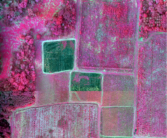
iii. What features now jump out? What vegetation shows up pink? How about deep red? Take some screen shots and paste them in below.
A lot of things jump out at first. To me, the trees jump out the most because they are the most colorful. All the healthy vegetation is showing up in pink. Its hard to see the difference in deep red and pink.

Figure. 2: Doakspreburn_1to5 in false color IR.
c. Turn off the Doakspreburn and turn on Doakspostburn. Notice how several of the plots are now burned and appear a dark brown color. Turn this image into a false color IR image and note any differences.
d. It can be difficult to turn the layers on and off to compare, but there is another way as shown in the lecture demo. A great way to look between two data layers is to use the Swipe tool. If you have not yet, click on the Appearance tab and use the swipe tool to look at the preburn layer vs. the postburn layer.
i. Zoom in on some of the burned areas and take screen shots of the before and after using the swipe tool.

Figure. 3: Preburn layer vs postburn layer compared with swipe tool.
9. In class I mentioned how scientists often take multiband composite rasters and calculate indices as a means to simplify what the bands display. One of the most popular (and misused) indices out there is the NDVI, which uses the NIR band as means display vegetation health.
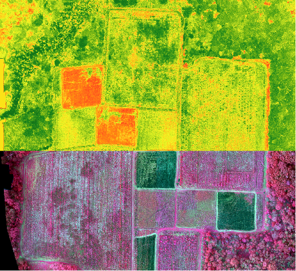
a. Turn off any data layers and turn on the Doakspostburn_NDVI. What areas show up red? Yellow? Dark Green?
The burned areas show mostly red with some yellow. Parts of the field are also shown in yellow. There is green spots all around the imagery.
b. Compare this NDVI with the Doakspostburn Composite using either false color IR or true color RGB. (Hint: use the swipe tool)
i. What patterns and relationships can be seen between the raster composite and the NDVI
The burn areas can be easily seen in both images.
ii. Zoom into some notable areas of interest and take some screen shots and paste below to relate to your discussion

Figure. 4: Postburn real RGB vs false color IR.
10. Take some time to play around with the imagery and generate your own band combinations and take note of what occurs with the imagery
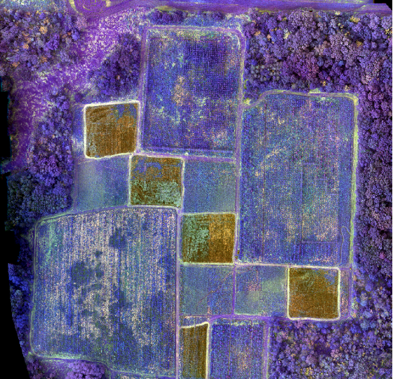
a. What was one of the band combinations you created? Take a screen shot and paste it in below and discuss what features the combination makes stand out.
Red: Band 1
Green: Band 3
Blue: Band 4

Figure. 5: Created a false color IR with random bands.
The burned areas can still be seen with this combination. The paths still jump out. The trees in the surrounding area are a bit darker than the actual field. The field appears blue but the trees appear purple.


Comments